นำเสนอร้าน Wedding ของชำรวยกระเป๋าผ้า
http://khopjaye.blogspot.com/
วันศุกร์ที่ 5 ธันวาคม พ.ศ. 2557
วันจันทร์ที่ 1 ธันวาคม พ.ศ. 2557
Final ปิดภาคเรียน
สรุปผลการออกแบบเพื่อพัฒนา
 | ||||||
ภาพถ่าย Get Set DEWY
ภาพถ่ายการนำเสนอผลงาน GET SET DEWY

 การนำเสนอด้วย Mood board ส.2
|


 |
| ภาพถ่ายการนำเสนองาน |
 |
| ภาพถ่ายการนำเสนองาน |
วันอาทิตย์ที่ 30 พฤศจิกายน พ.ศ. 2557
วันพุธที่ 26 พฤศจิกายน พ.ศ. 2557
สรุปผลการเรียนรู้วันที่ 24 พฤศจิศกายน 2557
มีการสอบ post test ทางระบบ http://www.clarolinethai.info/index.php

ตอบโพส การเรียนการสอนของเทอมที่ผ่านมา ใน http://arti3314.blogspot.com/
และการทำแบบสำรวจหลังสอบใน http://arti3314.blogspot.com/p/survey.html
และสอบภาคปฏิบัติปลายภาค แบบทดสอบปฏิบัติปลายภาคเรียนวิชาออกแบบกราฟิกสำหรับบรรจุภัณฑ์ 10 คะแนน เวลา 3 ชั่วโมง
ตัวอย่างที่ได้ทำการออกแบบ
ตอบโพส การเรียนการสอนของเทอมที่ผ่านมา ใน http://arti3314.blogspot.com/
และการทำแบบสำรวจหลังสอบใน http://arti3314.blogspot.com/p/survey.html
วันเสาร์ที่ 22 พฤศจิกายน พ.ศ. 2557
แปลสรุปข่าว
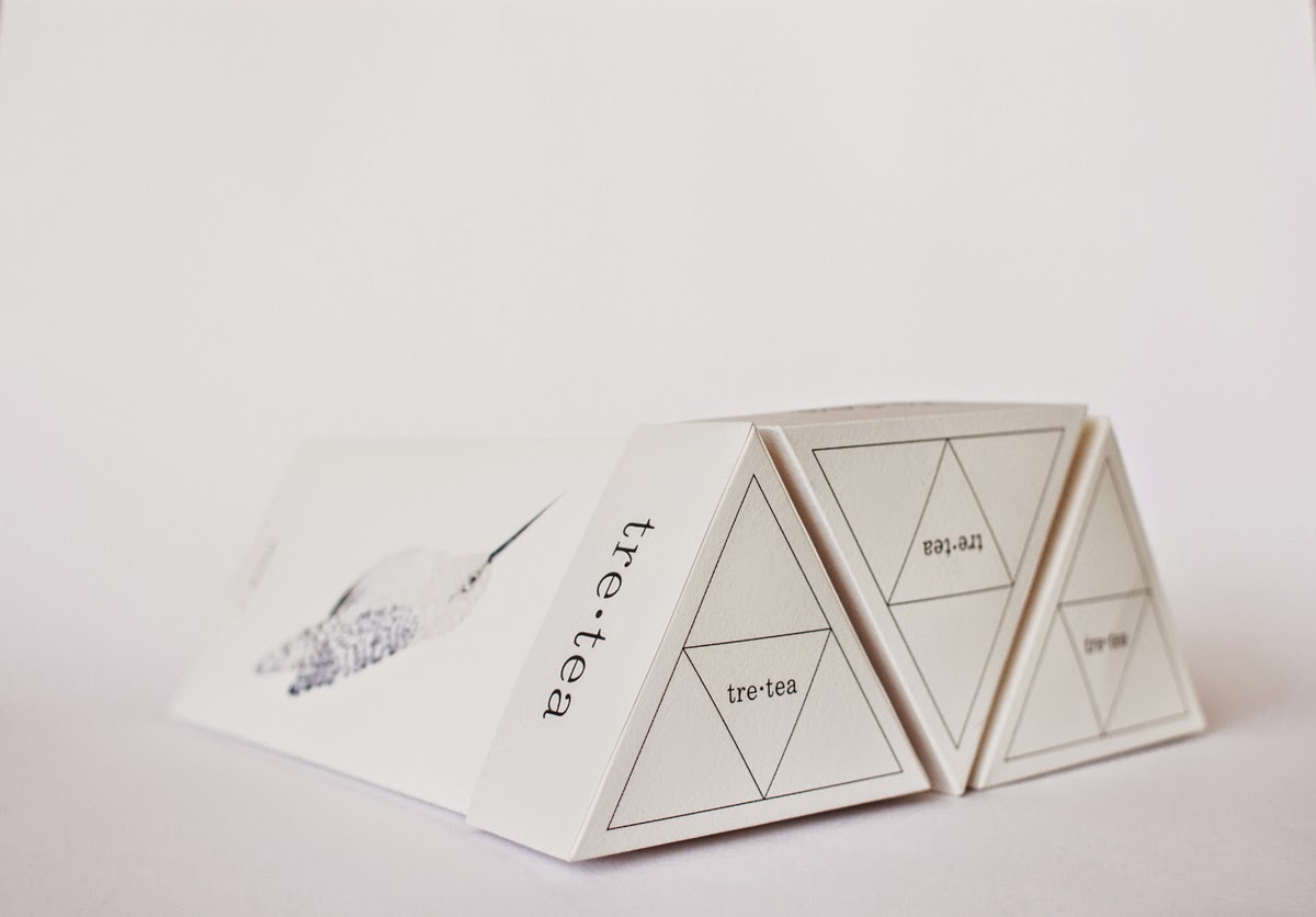
tre•tea
.jpg)
.jpg) The goal of the project was to experiment with contrasting elements: simple shapes and intricate illustration detailing. Effortless outside and sophisticated inside.
The goal of the project was to experiment with contrasting elements: simple shapes and intricate illustration detailing. Effortless outside and sophisticated inside.
.jpg)
.jpg) From technical point of view everything gravitates around the strongest geometric figure, the equilateral triangle. The tea box represents a triangular prism that contains three special sections inside, where tea bags (with three different flavors) are nestled. By pulling the tab at the top, you can access the product. The triangular prism requires less material, thus minimal expenses. Multiple boxes can be easily stored one along the other into a tessellated composition. The packaging is designed to be printed on recycled paper to enhance the natural and earthy feel of the product.
From technical point of view everything gravitates around the strongest geometric figure, the equilateral triangle. The tea box represents a triangular prism that contains three special sections inside, where tea bags (with three different flavors) are nestled. By pulling the tab at the top, you can access the product. The triangular prism requires less material, thus minimal expenses. Multiple boxes can be easily stored one along the other into a tessellated composition. The packaging is designed to be printed on recycled paper to enhance the natural and earthy feel of the product.
-1.jpg)
.jpg)
.jpg)
.jpg)
.jpg) Three birds illustrated on the sides of the box depict a figurative representation of each of the three flavors (white, tropical and black tea). Highly detailed and whimsical creatures are assembled from countless feathers cut from a number of photographs from my personal archive. By contrast, the design of the brand and the logo is deliberately clean and simple, although playful. The name tre•tea derives from the concept of the project: the word tre means three in italian. Three are the letters that it contains, three are the flavors of the tea, three are the sides of the dominant packaging shape.
Three birds illustrated on the sides of the box depict a figurative representation of each of the three flavors (white, tropical and black tea). Highly detailed and whimsical creatures are assembled from countless feathers cut from a number of photographs from my personal archive. By contrast, the design of the brand and the logo is deliberately clean and simple, although playful. The name tre•tea derives from the concept of the project: the word tre means three in italian. Three are the letters that it contains, three are the flavors of the tea, three are the sides of the dominant packaging shape.
The logo is intentionally designed in lowercase to evoke a human and honest feeling, without being too invasive, while the feminine LiSong Pro Light delivers an artistic airy effect, such as in poetry. The dot placed symmetrically between the words tre and tea symbolizes the point of balance and harmony that a cup of good tea could bring. It also invite us to slow down, stop for a moment, relax and enjoy.
.jpg)
.jpg)
.jpg)
The logo is intentionally designed in lowercase to evoke a human and honest feeling, without being too invasive, while the feminine LiSong Pro Light delivers an artistic airy effect, such as in poetry. The dot placed symmetrically between the words tre and tea symbolizes the point of balance and harmony that a cup of good tea could bring. It also invite us to slow down, stop for a moment, relax and enjoy.
แหล่งที่มา : http://www.packagingoftheworld.com/2014/10/tretea-concept.html
เรียบเรียงข้อความใหม่
tre•tea นักออกแบบคือ Natalia Bivol โดยชาวอเมริกา บรรจุภัณฑ์ของ tre•tea ถูกออกแบบมาในลักษณะทรงเราขาคณิต รูปสามเหลี่ยมปริซึม นกสามตัวที่แสดงอยู่ข้างกล่อง บ่งบอกถึงรสชาติทั้งสามรสชาติที่แตกต่างกัน บรรจุภัณฑ์ของ tre•tea ถูกออกแบบด้วยกระดาษริไซเคิล เพื่อเพิ่มความรู้สึกเป็นธรรมชาติ
การออกแบบโลโก้เป็นที่ดูสะอาดและเรียบง่าย tre คือ เลขสาม หมายถึง รสชาติของชาทั้งสามรสชาติ
และ แพค'เคจทั้งสามด้านใน รูปสามเหลี่ยมปริซึม จุดที่วางระหว่าง TreกับTea แสดงถึงความสมดุลและความกลมกลืนของถ้วยชาที่ดี
สรุปผลการเรียนรู้วันที่ 17 พฤศจิกายน 2557
สรุปผลการเรียนรู้


ขอขอบคุณ : อาจารย์ประชิด ทิณบุตร (ผู้สอน)
สร้างโฟล์เดอร์ในไดฟ์ แชร์ให้อาจารย์ ตั้งโฟล์เดอร์ ส.1-ส.3ปิดคอร์สการเรียนการสอน
วันจันทร์ที่ 24 พฤศจิกายน สอบ post test
Pattern ที่ได้รับกรออกแบบ
งาน pattern ออกแบบลวดลายภาพประกอบพื้นหลัง กราฟิกเกี่ยวกับด้านสุขภาพและความงาม ขนาด 1x1 นิ้ว 2 แบบ
ขอขอบคุณ : อาจารย์ประชิด ทิณบุตร (ผู้สอน)
วันศุกร์ที่ 14 พฤศจิกายน พ.ศ. 2557
สรุปผลการเรียนรู้วันที่ 10 พฤศจิกายน 2557
สรุปผลการเรียนรู้
การทำการวิจัยต้องมีการสังเกตผลการทดลอง แล้วสรุปผลลัพธ์ที่ได้
แนวการเขียนวัตถุประสงค์
R & D / Invention
1. เพื่อออกแบบ/สร้าง/พัฒนา………….. = ตัวแปรที่ศึกษา/ตัวแปรต้น
2.เพื่อทดสอบ……..ประสิทธิภาพ/ความคิดเห็น/ของ…...ตัวแปรตาม
VPAT
V = Variables ตัวแปรที่ศึกษา (ตัวแปรอิสระ) สามารถเพิ่มเติมข้อมูล หรือเปลี่ยนแปลงไปในทางที่ดีขึ้น
P = Poppulation ประชากรที่ศึกษา สิ่งที่เราศึกษา (บรรจุภัณฑ์) ระบุหัวข้อที่ทำให้ชัดเจนถูกต้อง
A = Area พื้นที่/ขอบเขต (การศึกษา)
T = Time (ระยะเวลา)
 |
| มู้ดบอร์ดแสดงผลงานและกระบวนการทำงาน ขอขอบคุณ : อาจารย์ประชิด ทิณบุตร (ผู้สอน) |
สมัครสมาชิก:
บทความ (Atom)